Subscribe
- Sanskaar 101
- Spotlight
- Wedding Diaries
- Fashion & Beauty
- Trends & Culture
- Astrology
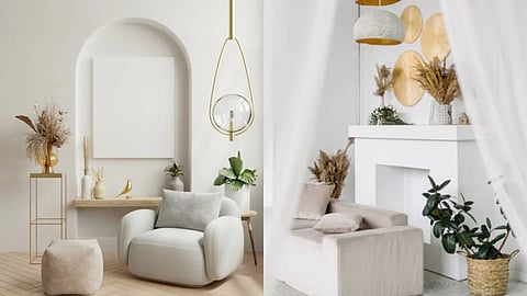
Pantone’s 2026 Colour of the Year, Cloud Dancer, is not a statement shade. It is neither dramatic, saturated, nor trend-hungry. Cloud Dancer is a quiet white, almost weightless, chosen in response to a cultural mood that feels overstimulated and visually fatigued. After years of maximal palettes and algorithm-driven interiors, homes are now moving back toward softness, breathability, and emotional ease.
From textured ceramics to sculptural objects, and from armchairs to tiles, a considered mix of materials allows Cloud Dancer to feel layered rather than blank. Whether you are reworking an entire living room or introducing smaller accents into a dining space, the appeal lies in restraint. The colour works best when it holds space instead of demanding attention.
Radhika Gupta, Designer and Co-Founder of Rabyana Design, explains that colour-led rooms do not always need contrast. Sometimes they need temperature. “Colour of the year inspired rooms gain warmth, depth, and subtle sophistication from subtle gold finished details. These finishes work best when applied sparingly, allowing the colour palette to remain the hero while gold enhances it subtly.”
The gold accents add a sophisticated element that complements modern decor. “Earthy, neutral, or soothing hues mix well with soft, brushed, or muted gold tones because they create a sense of balance and gently reflect light. This shade of white offers a sense of grounded serenity, making it the perfect choice for interiors that exude calmness and sophistication. “Gold adds a touch of subtle richness without overpowering the room, whether introduced through décor accessories, sculptural objects, candle holders or trays,” Radhika adds.
When used thoughtfully, gold helps anchor colour-led interiors, lending them warmth and timeless appeal. “The result is a space that feels elevated, well curated, and elegant, where colour and material come together seamlessly rather than competing for attention.”
Gupta notes that the success of a pale palette depends on emotional balance rather than colour accuracy.
“Colour of the Year inspired decor has a strong emotional impact when applied with restraint and intention. Instead of saturating an entire room, using these tones in layers through accent decor, soft furnishings, or textured surfaces helps you create a sense of calm and balance," says Radhika.
In a Cloud Dancer room, gold also works less like decoration and more like punctuation. Think of a tray on a console, a low candle stand on a coffee table, or a single sculptural accent that prevents the palette from feeling clinical. The white stays airy, while the metal introduces human warmth.
“We often pair Colour of the Year hues with neutral backdrops and natural materials like wood, stone, glass, and metal to maintain visual softness. This combination ensures the space feels grounded and breathable rather than overwhelming.”
By focusing on texture, proportion, and thoughtful placement, colour becomes a tool for comfort rather than distraction. The result is a living space that feels warm, welcoming, and personal, one that encourages relaxation and connection while remaining timeless in its design approach.
The key takeaway is that Cloud Dancer should never appear flat. Linen upholstery, limewash walls, matte ceramics, brushed metals, and raw wood introduce shadow and depth. The eye reads variation, even if the colour remains nearly the same.

Buy here.
Buy here.
Buy here.
Buy here.
Buy here.
Buy here.