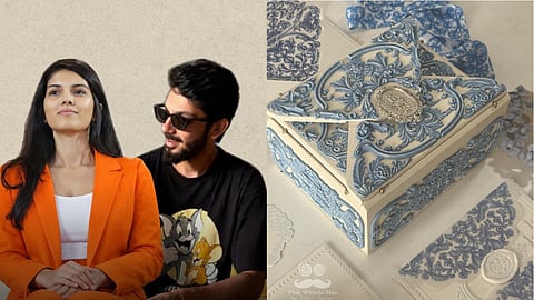
It's all eyes on the November union of music composer Anirudh Ravichander and SunRisers Hyderabad CEO Kaviya Maran. Bringing together two powerhouse families, the celebration—rumoured to take place in Greece—has sparked intense speculation about the different events, decor and fashion. And one of the first details to have surfaced, is in the way of their wedding reception card. Created by Pink Whistle Man, the invitation—all dressed in blue—made its way to Instagram and went viral immediately.
Designed by the bespoke stationery studio Pink Whistle Man, the invitation moves away from traditionally heavy, over-the-top wedding cards. Instead, it embraces the art of quiet, understated luxury, in a palette of powder blue, ivory, and silver.
Ranjani Iyengar, founder of Pink Whistle Man, shares with Manifest what went into making it and why luxury wedding stationery can explore a lot more, especially when experimenting with materials, textures and construction.

Anirudh Ravichander and Kaviya Maran's baroque-themed ivory reception invite has gone viral ahead of their wedding. How does it feel to have made it?
Ranjani Iyengar (RI): I’m very happy with how the Chennai Reception invite has turned out. For me, one of the most rewarding part of the process was the whole process itself. Working with the families and couples closely was extremely fun. The response to the invites are quite lovely; I didn't expect it to blow up so much.
What was the inspiration behind the design? Take us through it, and what was Kaviya's brief?
(RI): The brief was to create something classic, elegant and timeless, but with a keepsake value, almost like a relic that people would want to hold on to. Given how many different kinds of invitations people are exposed to today, we also wanted to create something that would stand out.
The idea was to incorporate a three-dimensional element into the invitation, which led to the carvings on the box. The construction itself was intricate, and we had to work through several aspects to get it right.
The initial brief came from both the families and the couple. I discussed the design with them, and Kaviya was very involved throughout the process. She's great with attention to detail, so we worked quite closely together.
They wanted soothing colours, so we settled on powder blue, ivory and silver. The intention was to keep the invitation classic without making it feel cluttered or overly colourful. They also didn't want it to explicitly tell their story, so we kept the design understated in terms of personalisation.
You have mentioned on Instagram that designing these invites for Kaviya and Anirudh has been the most wholesome experience ever. Please share more.
(RI): It's been a very wholesome experience because of the warmth they brought to the process, their clarity of thought, the ease of working with them and how involved they were throughout. They were accessible, made decisions clearly and responded quickly, which helped keep the process moving.
I've noticed that what makes an invitation design process work particularly well is a dynamic interaction between the client and the designer. The design is constantly evolving and going through iterations, and it's difficult to know exactly what the final outcome will look like when you first begin.
With them, there was a great deal of trust, which makes a significant difference. When clients trust the designer and the process, they're more open to exploring ideas, considering suggestions and allowing the creative direction to develop. I think that freedom is important because it gives the design room to evolve.
Although they are extremely creative people themselves, they were willing to flow with the process. I found all the right ingredients in place, from the exchange of ideas to the trust and openness, which made it an extremely satisfying experience to work on.
How long did it take to create?
(RI): The entire process took approximately three and a half months.
The first spark of the concept came together surprisingly quickly, within about a week. However, the conceptualisation was an iterative process, and the design evolved considerably over time.
There were multiple iterations, with changes to the materials and several aspects of the construction. We had to rethink how the hinges were held, as well as the quality and weight of the box. While the initial idea came together quickly, getting everything to its final form took much longer.
Can wedding stationery go very luxe? What are the different other luxury wedding stationery invites you have done?
(RI): Luxury wedding stationery can explore a lot more than traditional paper invitations, particularly when you start experimenting with materials, textures and construction.
Over the last couple of years, I've been exploring materials such as metal and wood, along with different moulds and POP. Physical invitations offer a lot of scope to experiment with their look and feel, and even to build a story around the material itself.
Some of the other projects I've worked on include Radhika Merchant's wedding invitation, Gaurav Kapoor and Kritika Kamra's wedding, and Alanna Panday's wedding. I've also worked with Luv Ranjan, Vijay Nambiar and several other directors, as well as cricketer Jaydev Unadkat.
Was it meant to have a vintage-theme and an old-world charm?
(RI): I wouldn't say this invitation was intended to be European-themed or vintage. The design evolved naturally, which is usually how the creative process unfolds for me. We begin with an underlying concept, but I prefer to let the design take shape organically rather than define every aspect of it from the outset.
In this case, we started by exploring a more generic design because we didn't want it to revolve around a specific motif, whether flowers, characters or animals. We initially considered working with blues, whites and reds, possibly incorporating greens as well. However, when the couple saw the blue and white combination, they suggested sticking to two colours because it would look classier.
Even the distressed effect on the box wasn't something we had planned. While experimenting with paint, we noticed that tapping some white paint onto the surface enhanced its appearance, and that's how the effect came about.
So, while the final design may have vintage or European visual associations, that wasn't our original intention. It was simply a result of letting the design evolve through experimentation and the choices we made along the way.
From destination weddings in Europe to palace celebrations in India, how does the venue influence the design language of an invitation?
(RI): I try not to make the design too specifically influenced by the location or rely on a very literal representation of a story. In this case, the invitation wasn't driven by the wedding destination or a particular narrative. The focus was on the appeal of the design itself and allowing it to evolve naturally.
Even when I'm developing a theme for an invitation, I prefer to work with symbolism rather than literal references to a location. I think this allows the design to have its own identity instead of being a direct representation of where the celebration is taking place.